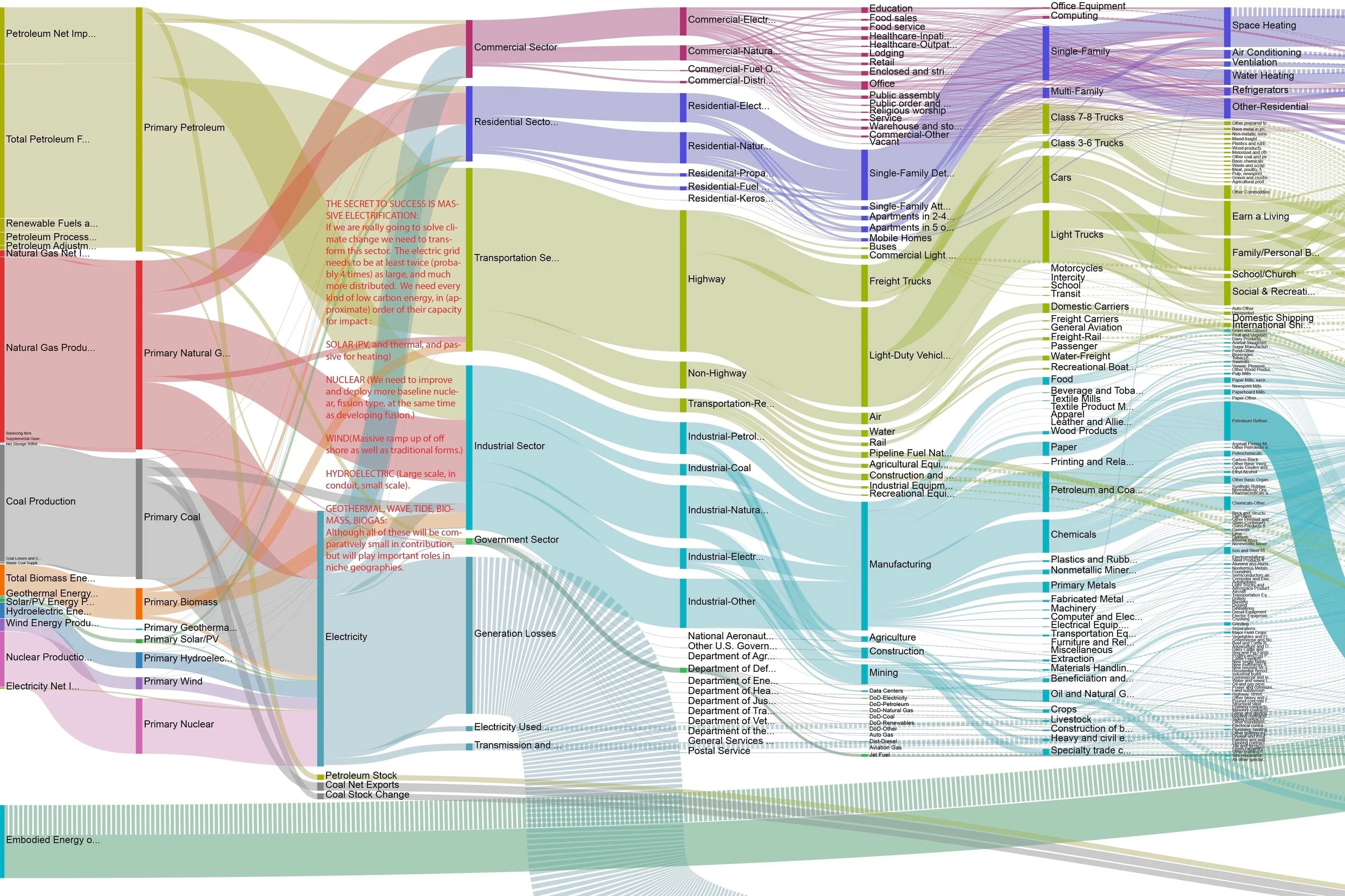
US Energy Flow Super Sankey
The diagram above is too small to read in detail; for best understanding, it requires a large wall display. The interactive online version at http://energyliteracy.com allows the viewer to drill down into any particular industry sector and understand the energy that it produces or consumes.
In 2017, Otherlab was contracted by the Advanced Research Project Agency of the Department of Energy (ARPA-e) to review all available energy data sources and create an ultra-high resolution picture of the U.S. energy economy. The purpose was to identify research priorities and to model scenarios for new energy technologies and policies. This work leveraged many decades of effort by the U.S. Energy Information Agency (PDF) and Lawrence Livermore National Lab analyzing the U.S. energy economy and providing annual snapshots in a Sankey Flow Diagram format. The Otherlab "Super Sankey" tool is available at www.departmentof.energy — yes, we were cheeky in choosing that URL.
This work on mapping U.S. energy usage began in 1973, when Jack Bridges, working for the Joint Committee on Atomic Energy (an intellectual precursor to the Department of Energy), used the Sankey format and improved upon it in a fabulous book, "Understanding the National Energy Dilemma (PDF)." The committee had been charged to "develop an energy display system which, in less than an hour, could give an extremely busy person an understanding of the size and the complexity of our national energy dilemma." That "busy person" was meant to represent the decision makers in Congress.
The interactive Sankey diagram we created for ARPA-e in 2018 represents all of the energy flows in the U.S. economy, from "primary energy" sources such as coal, natural gas, oil, hydropower, solar, geothermal and nuclear power, through their transformation into intermediate sources such as gasoline, diesel and other intermediate fossil fuels, or electricity, and then their use by various sectors of the economy.
“I think we may be the first three or four people to read every footnote in every energy agency document ever produced.” -Saul Griffith
The diagram also represents the energy that is used in those transformations, including the energy used in generation, lost in transmission or embodied in products and materials that use energy in their production. The width of a given flow identifies the size of a given energy use and thus points the way to the most impactful interventions to reduce energy use or enable decarbonization.
Energy use at the scale of the national economy is measured in quads. One quad is 1 quadrillion British Thermal Units (BTUs). Conveniently, the United States uses about 100 quads each year, meaning that one quad is roughly equal to 1 percent of the country's total national annual energy use.
Related Posts